Every successful creator understands one thing: your brand starts before anyone watches your first video. Long before viewers click the play button, they notice your visual identity. One of the most important elements in that identity is your YouTube Channel Logo.
A logo is more than a graphic. It is the visual stamp people associate with your content, your personality, and your value. Whether you run a tech channel, a vlog, a gaming stream, a business channel, or a tutorial hub, your YouTube Channel Logo sets the tone. It shapes the first impression and helps viewers remember you.
This article explores practical tips that real creators use to design a striking logo that grows their presence and boosts performance.
Table of Contents
ToggleUnderstand What Makes a Good YouTube Channel Logo
Before designing anything, you need to understand the purpose behind the logo. On YouTube, logos appear small—often on mobile devices—so they need to be simple, clear, and instantly recognizable.
A strong YouTube Channel Logo usually has:
-
Clarity
-
Simplicity
-
Consistency
-
Personality
-
Scalability
It’s not about making the most complex design. It’s about making something people notice and remember.
Keep It Simple for Better Visibility
Simplicity wins on YouTube. With millions of channels competing for attention, viewers only look at your logo for a split second. If the logo is crowded, overly detailed, or too stylish, viewers won’t understand it.
Simple logos are:
-
Easier to recognize
-
More memorable
-
Clear even on small screens
-
Easier to reproduce in thumbnails and banners
Think of major YouTube creators. Most of their logos are clean shapes, initials, or simple icons. Minimalism works because people process it instantly.
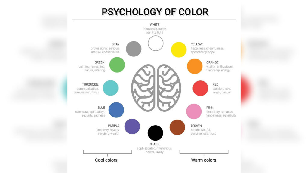
Choose Colors That Represent Your Brand
Color psychology plays a huge role in how viewers perceive your channel. Your logo’s color palette should match the type of content you create and the emotions you want to trigger.
Here are simple examples:
-
Red for energy and excitement
-
Blue for trust and knowledge
-
Yellow for positivity and creativity
-
Green for calmness and growth
-
Purple for uniqueness and imagination
-
Black and white for simplicity and professionalism
Pick two to three main colors. Too many colors can weaken the design and reduce recognizability.
Use Typography That Matches Your Style
If your YouTube Channel Logo includes text or initials, the typeface should match the character of your channel.
A gaming channel might use bold, dynamic type.
A beauty channel might use elegant or soft fonts.
A business channel might use clean, modern typography.
The goal is to choose a typeface that represents your identity and stays readable even at small sizes.
Add a Symbol That Represents Your Content
Symbols tell a story faster than text. A simple icon in your logo can help viewers understand what your channel is about in seconds.
Examples:
-
A camera for filmmaking channels
-
A paintbrush for art creators
-
A dollar sign for finance channels
-
A dumbbell for fitness creators
-
A globe for travel vloggers
Symbols make your YouTube Channel Logo easier to identify and more emotionally engaging.
Make Sure Your Logo Works at Small Sizes
Your logo appears in small places:
-
Under videos
-
In comments
-
On mobile screens
-
In recommended videos
-
Inside search results
Because of this, test your logo at multiple sizes. If it becomes blurry or unreadable when small, simplify it further.
A good YouTube Channel Logo looks perfect even at tiny visual sizes.
Stay Consistent With Your Other Branding Elements
Brand consistency helps people connect the dots between your videos, your logo, and your style. Your logo should match your:
-
Thumbnail design
-
Banner
-
Color palette
-
Editing style
-
Channel tone
Consistency builds trust and shows professionalism. When viewers see your content on their feed, they should immediately know it’s yours.
Study Competitors but Avoid Copying Them
Looking at other channels in your niche is helpful. It gives you inspiration and shows what works. But copying another creator’s style weakens your identity.
Ask yourself:
-
What makes their logos strong?
-
How do they use color and typography?
-
What makes them memorable?
Use these insights to shape your own, unique visual identity.
Hire a Designer if You Need Professional Quality
Not every creator is a designer—and that’s okay. If you want a polished YouTube Channel Logo that gives your brand a professional edge, consider hiring a graphic designer.
A designer can:
-
Understand your audience
-
Create multiple concepts
-
Craft unique symbols
-
Build a scalable logo
-
Deliver high-quality files
Your logo is an investment that pays off over time.
Test Your Logo Before Finalizing It
Before you commit to your final design, test it with real people. Send it to friends, followers, or family members. Ask them:
-
What do you think this logo represents?
-
Do you recognize the brand easily?
-
Does it look clear and professional?
-
Would you click a channel with this logo?
Feedback reveals how viewers see you—not just how you want to be seen.
Update Your Logo as Your Channel Grows
Growth brings change. Your channel might evolve into a new direction. You may improve your skills, shift niches, or develop a stronger identity. Updating your logo to match your evolution is perfectly normal.
Many top YouTubers refine their logos over time while keeping the main elements consistent.
How Your YouTube Channel Logo Improves Click-Through Rates
Click-through rate is one of the strongest signals YouTube uses to push videos into the algorithm. Most creators focus only on thumbnails, but your logo also plays a role—especially for returning viewers.
Here’s how:
Familiarity encourages clicks
If people recognize your logo instantly, they trust your content and click faster. A strong identity increases your visibility and makes it easier for your content to stand out even in a crowded feed.
Builds authority over time
When your logo appears consistently under your videos, in recommendations, and in comments, it becomes a visual stamp of quality. Viewers start associating your logo with the content they like.
Helps YouTube understand your brand
Consistency across thumbnails, banners, and your YouTube Channel Logo helps YouTube’s system identify your niche. This strengthens your brand signals, helping your videos reach the right audience.
Small visuals create big results when used strategically.
Create Several Variations for Versatility
A single version of your logo is not always enough. Different situations require different compositions.
You may need:
A primary logo
Used for your channel profile picture.
A simplified icon version
Perfect for small placements like comments or small thumbnails.
A horizontal version
Useful for banners, social media headers, and website placement.
A watermark version
A clean, minimal version for video branding.
Having various formats ensures your logo always looks sharp and professional, no matter where it appears.
Balance Creativity with Practicality
Some creators push for the most unique logo possible. Others prefer something extremely simple. The best YouTube Channel Logo sits in the middle.
Practical considerations include:
-
Can viewers recognize it quickly?
-
Does it look good against light and dark backgrounds?
-
Does it keep its clarity when scaled down?
-
Does it represent your personality?
-
Does it match your niche?
Creativity grabs attention, but practicality keeps everything consistent.
Add Personality to Make Your Channel Memorable
Your logo should reflect who you are.
If your channel is fun and energetic, the colors and shapes should feel lively.
If your channel is inspirational or educational, the design should feel calm and structured.
Personality makes your logo unique. It tells viewers what to expect before they even watch your videos.
YouTube is full of generic logos—your personality is the difference.
Use Shapes That Are Easy to Recognize
Shapes influence how people interpret your brand emotionally.
Circle
Friendly, soft, creative
Square
Modern, stable, strong
Triangle
Dynamic, bold, energetic
Abstract shapes
Unique, unpredictable, artistic
Choosing the right shape for your YouTube Channel Logo helps you communicate subtle emotions without saying a word.
Make Sure It Works Across All Platforms
Your YouTube Channel Logo won’t just appear on YouTube. It needs to work on:
-
TikTok
-
Instagram
-
Facebook
-
Twitter (X)
-
Websites
-
Merchandise
-
Posters
-
Email signatures
-
Business cards
This means your logo should be versatile and instantly identifiable across all environments. A multi-platform identity increases brand growth and consistency.
Think Long-Term Instead of Trend-Based
Trendy designs become outdated quickly. Logos that rely heavily on current design trends—such as neon gradients or overly stylized icons—can feel old after a few months.
A timeless logo lasts longer because:
-
It evolves well with your channel
-
It stays relevant for years
-
It keeps your brand stable as you grow
Trends can inspire you, but timeless design should guide you.
Avoid These Common Mistakes When Creating a YouTube Logo
New creators often make avoidable mistakes that weaken their brand. Here are mistakes to watch out for:
Using too many colors
This makes the logo confusing and hard to print or scale.
Adding long text
Logos with long words are unreadable in small circles.
Overcomplicating the design
More details mean less clarity.
Ignoring brand consistency
Your logo should match your thumbnails and general style.
Not testing on mobile
More than half of YouTube traffic comes from mobile devices.
Avoiding these mistakes instantly elevates your YouTube Channel Logo.
Why Your Logo Should Match Your Thumbnails
Your thumbnail style is the face of your content. Your logo supports that visual system. When both work together, viewers form a stronger connection with your brand.
Matching creates:
-
Faster recognition
-
Consistent brand identity
-
Professional design appeal
-
Emotional connection
-
Stronger viewer loyalty
Imagine seeing a thumbnail several times with the same color palette and then seeing a logo that matches those colors. The brain immediately links the two.
This is how brand memory grows.
The Logo You Choose Will Shape Your Channel’s Future
Your YouTube Channel Logo is not just a design decision. It is part of your long-term strategy.
It influences:
-
How people view your brand
-
How quickly viewers recognize your content
-
How consistent your channel looks
-
How professionally you appear
-
How much trust viewers place in your videos
A strong logo becomes your visual signature. It guides your entire identity—from thumbnails to merchandise.
This is why designing it with intention matters.
Keeping Your Logo Consistent Across All Touchpoints
A strong YouTube Channel Logo should appear the same everywhere your audience finds you. Consistency builds trust, and trust builds long-term followers. Make sure the logo you upload on YouTube matches what’s on your thumbnails, Instagram posts, TikTok clips, and website. When viewers see the same visual identity across platforms, they instantly associate it with your channel’s personality and content style. This reduces confusion and reinforces your brand in their memory.
Avoid frequently changing your logo unless your channel goes through a major rebrand. If you adjust your style every few months, your audience may struggle to recognize your content. Stability helps your channel grow with a clear identity that stands out, especially in a crowded niche.
Why Your YouTube Channel Logo Should Be Adaptable
A logo that looks good only in one place is limiting. It needs to be adaptable. On YouTube, your logo appears in different sizes and contexts: profile photo, channel banner preview, watermark, and even in suggested sections next to other creators. If it loses clarity in smaller displays, it weakens your brand presence.
Aim for a design that works in large and tiny formats. A scalable logo gives you flexibility when creating merch, digital products, or running ads. A simple test is to shrink the logo to the size of a coin on your screen. If you can still identify it instantly, you’re on the right track.
Adding Personality to Stand Out in Your Niche
YouTube is full of creators using generic symbols and overused design trends. If you want your YouTube Channel Logo to work harder for you, it has to show your personality. Think about your channel’s tone. Are you energetic, calm, educational, bold, or funny? Your logo should reflect that energy visually.
A gaming channel might use dynamic edges and high-impact shapes. A learning channel might use soft lines and cleaner layouts. A beauty or lifestyle channel could go for elegant typography or calming color tones. When your logo aligns with your vibe, it instantly communicates what viewers can expect from your content.
Avoiding Common Mistakes That Hurt Your Logo’s Impact
Many creators unknowingly weaken their brand by making simple design mistakes. One common issue is overcrowding. When too many details are squeezed into a small space, the logo becomes unreadable. Another mistake is relying on trendy fonts or elements that may feel outdated within a year. Trends come and go, but a timeless design stays relevant.
Also, avoid picking colors just because they “look nice.” Every color carries meaning. If you choose something that doesn’t align with your content or audience, your visual identity may feel off. Take your time with color choices. A thoughtful palette gives your channel more depth and makes your visual style feel intentional.
The Role of Professional Design in Building a Strong Brand
While many creators start with DIY tools, investing in a professionally designed YouTube Channel Logo can elevate your entire brand. A designer understands balance, spacing, color psychology, and visual trends. They can create a logo that aligns with your channel’s mission and long-term vision. It’s the kind of investment that pays off as your audience grows.
A well-designed logo makes you look serious about your craft. Brands, sponsors, and collaborations will take you more seriously too. Think of it as building the foundation for your future success on the platform.
How a Great YouTube Channel Logo Strengthens Audience Trust
Viewers trust creators who appear consistent, polished, and intentional. Your YouTube Channel Logo plays a huge role in shaping that perception. When someone clicks on your channel and sees a clean, well-designed logo, it instantly signals professionalism. It tells your audience that you take your craft seriously.
A strong visual identity also makes your channel feel established, even if you’re new. People naturally gravitate toward creators who look confident and organized. Over time, your logo becomes a familiar symbol that viewers associate with reliable, high-quality content.
This trust is essential for growing your subscriber base. When a viewer repeatedly sees your logo while browsing recommended videos, they begin to recognize your brand even before reading the title. The more recognizable you become, the easier it is to build a loyal community.
How Your Logo Influences Click-Through Rates
Your logo indirectly affects how many viewers click and watch your videos. While thumbnails and titles are the main drivers of clicks, your channel’s branding influences whether someone chooses your content over others. A professional YouTube Channel Logo sets the tone for your entire visual style, helping your thumbnails look more cohesive and attractive.
If your channel looks visually appealing, viewers assume your videos are well-made too. This perception increases their likelihood of clicking. Strong branding makes you stand out in crowded categories, especially when viewers are scrolling quickly through search results or recommended feeds.
A memorable logo strengthens your overall visual ecosystem. Over time, people start clicking your thumbnails faster because they recognize your brand and trust what you offer.
Updating Your Logo as Your Channel Evolves
As your content grows, your branding may need adjustments. This doesn’t mean reinventing your YouTube Channel Logo every year. Instead, think of small refinements that reflect your growth. Many top creators keep their core identity but adjust elements like colors, spacing, or typography to match their evolving style.
If you switch your niche, target a new audience, or rebrand your channel, that’s when a more significant logo update makes sense. A refreshed visual identity can signal a new direction and reignite interest in your channel. Just make sure the new design still feels familiar to your existing audience.
A strategic update can help you appear more modern without losing your original identity.
Why Hiring a Designer Can Give You an Advantage
While DIY tools can work for beginners, many creators eventually reach a stage where they want a more distinct and competitive look. A professional designer can help you craft a YouTube Channel Logo that’s tailored specifically to your niche, personality, and goals.
Designers understand subtle things like:
– balance and proportion
– color harmony
– visual psychology
– scalability for different screen sizes
– long-term branding strategy
These details separate a basic logo from a truly iconic one. With the right designer, you can create a visual identity that makes your channel look like a brand, not just a profile.
This is especially valuable if you plan to launch merch, courses, or collaborations where branding plays a big role.
How Your Logo Connects Emotionally With Your Audience
Logos aren’t just shapes and colors. They carry emotion. A logo can make your audience feel excited, calm, inspired, motivated, or entertained before they even watch the video. The design elements you choose tell a story about your style and personality.
For example:
– Soft rounded shapes create a friendly and approachable feel
– Sharp geometric shapes give a bold and confident impression
– Minimalist designs feel modern and professional
– Vibrant colors evoke energy and passion
– Muted tones convey calmness and maturity
When your logo’s emotional tone matches your content, your audience forms a deeper connection with your brand. This connection is what turns passive viewers into loyal subscribers who return for more.
Bringing Your Logo Into Your Overall Content Strategy
Your YouTube Channel Logo should guide how your entire brand looks and feels. Once you finalize your logo, use it as the foundation for your thumbnails, banners, intro screens, and even your social media graphics. This creates a unified visual experience that makes your channel feel complete.
When viewers see consistency from video to video, they start to form a strong mental connection with your brand. Even small things like using similar color tones, fonts that match your logo’s style, or design elements inspired by your logo help strengthen your identity. This makes your content more recognizable, even when someone is scrolling quickly through their feed.
Think of your logo as the starting point of your story. Everything else you create visually should flow from it. This approach helps you build a memorable digital presence that feels intentional and polished.
Using Your Logo to Elevate Your Thumbnails
Your thumbnails are the most important visual assets on your channel. They determine whether someone clicks or scrolls past. When your thumbnails incorporate elements inspired by your YouTube Channel Logo, they instantly feel more professional.
This could be through:
– color accents that match your palette
– shapes or outlines inspired by your logo
– typography that complements your brand style
– a small watermark version of your logo for identity protection
When used properly, these touches make your thumbnails instantly recognizable. Over time, your audience learns to trust your style. Even without reading the title, they can spot your content simply by how it looks.
This recognition gives you a strong advantage, especially in competitive niches like tech, fitness, gaming, or lifestyle.
Why Your Logo Should Tell a Story
A great logo doesn’t just look good—it communicates something deeper. Your YouTube Channel Logo should reflect your values, your purpose, and the experience you want your audience to have. Think about the story behind your channel. What message do you want people to feel when they see your logo?
If your channel is about motivation, your logo might have bold, uplifting shapes. If your content focuses on calm learning, your design might lean toward minimal lines and softer colors. Story-driven design creates emotional attachment, and emotional attachment builds loyal viewers.
Your logo becomes a symbol your audience can relate to, not just a visual mark.
How Your Logo Helps With Future Growth Opportunities
A strong, well-crafted logo opens doors. As your channel grows, you may want to expand into other areas—merch, brand deals, partnerships, online coaching, or digital products. Having a professional YouTube Channel Logo gives you credibility when you approach companies or collaborate with other creators.
Brands love working with creators who look organized and visually consistent. Your logo becomes a stamp of quality that gives potential partners confidence in your work. This visual professionalism sends the message that you are serious, reliable, and committed to growing your presence online.
Opportunities increase when your branding is solid.
How to Know When Your Logo Is Working
Sometimes creators design a logo and hope it’s good enough. But there are signs that show whether your YouTube Channel Logo is truly effective. Here are things to look out for:
– People instantly recognize your content without reading the title
– Viewers comment about your brand or design style
– Your thumbnails feel consistent and easier to create
– Your logo looks clear even when displayed at small sizes
– Your social media pages look unified
– You feel proud of how your brand appears online
When your logo begins to feel like a natural extension of your channel’s personality, that’s a clear sign it’s working.
Simple Steps to Refresh Your Logo Without Rebranding
If you feel your current logo is “okay” but not great, you don’t need a full redesign. Small improvements can make a huge difference. You can:
– simplify complex shapes
– adjust spacing or alignment
– pick a cleaner font
– update your color palette
– remove unnecessary details
– create a stronger icon for smaller displays
These subtle tweaks help your YouTube Channel Logo feel more modern and professional while keeping your core identity intact.
Final Thoughts: Treat Your Logo as a Long-Term Investment
Your YouTube Channel Logo will be with you for years. It’s more than just a design—it’s a long-term investment in your identity, your audience, and your future brand opportunities. When your logo is carefully crafted, it becomes one of the most valuable assets you own as a creator.
It represents your voice, your mission, and the community you are building. And because YouTube is such a visual platform, the right logo can make your content more recognizable, more memorable, and more trusted.
If you want, I can help you brainstorm logo concepts, define your color palette, or create a creative brief that ensures your logo matches your niche and brand personality.