Colors are more than decoration; they are silent communicators that shape emotion, decision-making, and perception. In web design, every hue, tint, and tone can influence how visitors interact with a brand or product. Understanding the psychology behind color palettes for websites is crucial for creating designs that resonate with users and encourage action.
The Role of Color in Web Design
Color plays an essential role in how users experience a website. From first impressions to navigation and conversion, the color palette determines how visitors feel and behave. When used strategically, color can:
-
Increase brand recognition by up to 80%.
-
Improve comprehension and readability.
-
Trigger emotional connections and trust.
-
Guide users toward specific actions or content.
Web designers who understand color psychology can use it to subtly influence users and strengthen brand identity.
https://www.youtube.com/watch?v=e_kdWMmD3z0
The Science of Color Psychology
Color psychology studies how different hues affect human emotions and behavior. Each color carries its own psychological meaning. For example, blue often evokes feelings of trust and calmness, while red can create a sense of urgency or excitement. When designing a website, these associations should align with the brand’s message and audience expectations.
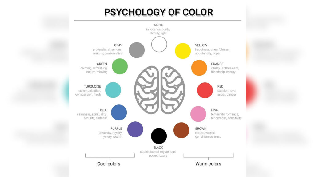
The Emotional Spectrum of Colors
Humans perceive colors differently depending on cultural, personal, and contextual factors. However, there are general emotional responses associated with specific colors:
-
Red: Energy, passion, excitement, urgency.
-
Blue: Trust, calm, intelligence, professionalism.
-
Green: Nature, health, balance, growth.
-
Yellow: Optimism, warmth, cheerfulness.
-
Orange: Creativity, enthusiasm, friendliness.
-
Purple: Luxury, mystery, spirituality.
-
Black: Sophistication, power, elegance.
-
White: Purity, simplicity, cleanliness.
-
Gray: Neutrality, balance, calmness.
Understanding these meanings helps designers choose the right color palettes for websites that align with emotional intent.

How Color Affects User Behavior
The psychology of color extends beyond aesthetics. It influences decisions, engagement, and overall usability. For example, a call-to-action button’s color can significantly affect conversion rates. Red buttons may stimulate urgency, while green ones suggest safety and approval.
The Impact of Color on Conversion
Studies show that users often decide whether to trust or engage with a website within the first 90 seconds of their visit—and most of that judgment is based on color. The right color palette can:
-
Encourage clicks on buttons and links.
-
Make forms and products stand out.
-
Enhance perceived value of services.
-
Reduce bounce rates by creating visual harmony.
In contrast, poor color choices can create confusion, strain the eyes, and push visitors away.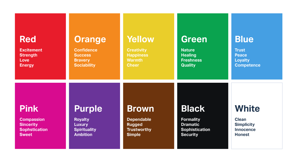
Choosing the Right Color Palettes for Websites
Selecting an effective palette involves balancing psychology, branding, and functionality. A well-thought-out palette should reflect the brand’s voice, maintain readability, and create a pleasant visual flow.
Step 1: Understand Your Brand Personality
Before choosing colors, clarify what your brand represents. Ask questions like:
-
Is the brand bold or calm?
-
Is it modern or traditional?
-
Is it playful or professional?
For instance, a wellness brand may lean toward greens and neutrals to evoke calm and health, while a tech startup might use blues and grays for trust and innovation.
Step 2: Know Your Target Audience
Color perception varies across age, gender, and culture. Younger audiences may prefer vibrant and playful tones, while older users often appreciate muted and classic palettes. Research your target demographics to ensure your color choices resonate with their preferences and cultural context.
Step 3: Create Harmony with Color Theory
Color theory helps designers build harmonious palettes that feel cohesive. Key approaches include:
-
Monochromatic: Variations of a single hue, ideal for minimalistic designs.
-
Analogous: Colors next to each other on the color wheel, creating smooth transitions.
-
Complementary: Opposite colors that create contrast and visual excitement.
-
Triadic: Three evenly spaced colors that offer balance and vibrancy.
Using these frameworks ensures that color palettes for websites maintain both harmony and contrast.
The Importance of Contrast and Accessibility
Color isn’t just about emotion; it’s about usability. High contrast ensures readability and accessibility for users with visual impairments. Designers should always test contrast ratios between text and background to comply with accessibility standards such as WCAG guidelines.
Tips for Accessible Color Design
-
Use dark text on light backgrounds for better readability.
-
Avoid color combinations that are hard to distinguish for color-blind users, such as red-green or blue-purple.
-
Provide texture or patterns along with color to convey meaning in visual cues.
-
Test your website using accessibility tools like contrast checkers.
An accessible color palette ensures that every visitor, regardless of ability, enjoys a seamless experience.
The Relationship Between Color and Branding
Brands are often remembered by their colors before their names. Think of the red of Coca-Cola or the blue of Facebook. Color consistency builds recognition and trust over time.

Creating a Brand Identity with Color
A consistent palette helps unify website elements, marketing materials, and social media profiles. It communicates reliability and professionalism. When users repeatedly encounter the same colors across different platforms, they subconsciously associate those hues with the brand’s identity and values.
The Power of Minimalism
Many modern websites embrace minimal color palettes to focus attention and reduce cognitive load. Using just two or three dominant colors can create a sleek and memorable experience. Minimalism ensures that color becomes a storytelling tool rather than visual noise.

Color Palettes for Different Website Types
Not all industries respond the same way to color. The ideal palette depends on your niche and goals.
E-commerce Websites
E-commerce sites often use vibrant accent colors to highlight promotions and calls to action. Red, orange, or yellow can prompt impulse purchases, while blue or green tones build trust during the checkout process.
Corporate or Professional Websites
Corporate sites benefit from cooler tones like blues, grays, and whites. These colors communicate stability, reliability, and intelligence, essential for businesses seeking client confidence.
Creative Portfolios
Designers and artists often experiment with unconventional or bold combinations. Creative websites can use high contrast and unique palettes to showcase originality and stand out.
Health and Wellness Websites
Soft greens, whites, and earth tones dominate health-related sites. They symbolize balance, nature, and tranquility, helping users feel calm and reassured.
Educational Websites
Educational sites thrive with blues and yellows, which represent clarity, optimism, and focus. These palettes make information easier to process and encourage learning engagement.
Cultural Influence on Color Choices
Color meanings vary across cultures. For example, white represents purity in Western societies but mourning in some Eastern cultures. Red signifies luck in China but can indicate danger in Western contexts. Global brands must consider cultural sensitivity when selecting color palettes for websites aimed at international audiences.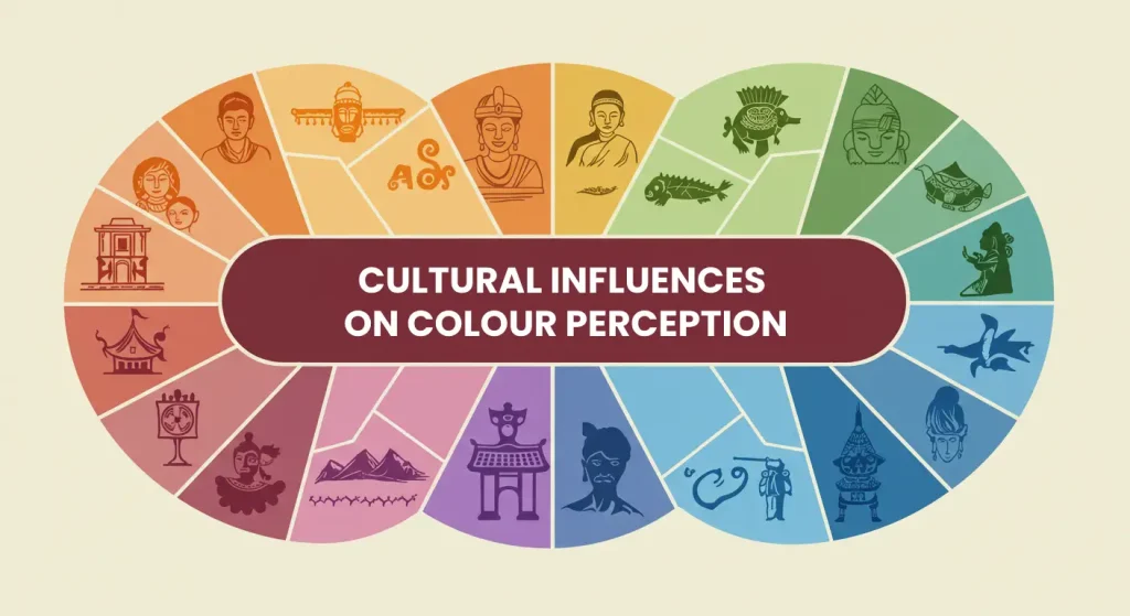
The Role of Neutrals in Web Design
Neutral tones like gray, beige, and white provide balance and structure. They prevent bright accents from overwhelming users and allow important elements to stand out. A neutral background can make colorful visuals appear sharper and more appealing.
Combining Neutrals and Accents
Using a neutral base with one or two accent colors helps direct attention. For example, a white background with blue and orange accents can guide the eye toward key areas like buttons or headers without cluttering the design.
Testing and Refining Your Color Palette
Design is never static. Testing how users respond to different color combinations can reveal what works best for conversions and engagement.
Methods to Test Color Effectiveness
-
A/B Testing: Compare two color versions of the same element to see which performs better.
-
Heatmaps: Analyze where users click and how colors affect navigation.
-
Surveys: Collect feedback on emotional response and readability.
Through iterative testing, designers can fine-tune their palettes for maximum impact.
Common Mistakes in Using Color Palettes for Websites
Even the most creative designs can fail if color is misused. Avoid these common pitfalls:
-
Using too many colors, creating confusion.
-
Ignoring contrast and accessibility guidelines.
-
Choosing trendy colors that don’t match the brand identity.
-
Failing to test across devices and lighting conditions.
A cohesive and thoughtful palette will always outperform a visually chaotic one.
Trends in Modern Web Color Design
Web design trends evolve, and so do color preferences. Recent trends emphasize emotional storytelling and user comfort.
Current Color Trends
-
Soft Pastels: Gentle and calming tones that evoke warmth.
-
Dark Mode Palettes: High-contrast designs that reduce eye strain.
-
Gradients and Blends: Modern and dynamic visuals for tech-forward brands.
-
Nature-Inspired Hues: Greens, browns, and blues that connect users to organic themes.
Trends can guide inspiration, but timeless palettes grounded in psychology endure the test of time.
Conclusion: Designing with Emotion and Purpose
The psychology behind color palettes for websites goes far beyond aesthetic appeal. Every shade, contrast, and combination influences perception, trust, and behavior. Successful web design blends art with psychology—balancing emotion, accessibility, and brand consistency.
When color choices align with your brand’s message and your users’ expectations, the result is not just a beautiful website but a powerful communication tool that drives connection and conversion.
Designers who master color psychology understand that color is not decoration—it’s strategy. By applying these principles thoughtfully, you can craft digital experiences that not only look good but also feel right.