The colors you choose for your brand can either draw customers in or push them away. In the competitive Kenyan business environment, the first impression often happens visually—on a signboard, product label, website, or Instagram post. And what speaks first? Color.
Color Palettes are the backbone of visual identity. They define your mood, speak to your audience’s emotions, and build lasting impressions. Whether you’re opening a nyama choma spot in Nairobi, launching a fintech app in Westlands, or running a fashion boutique in Kisumu, understanding how to choose the right colors is essential for success.
This article walks you through everything you need to know about choosing the right Color Palettes for your Kenyan business—from psychology and culture to branding strategy and design tips. It’s time to paint your brand with intention.
Table of Contents
ToggleWhy Color Matters More Than You Think
Before diving into selection strategies, let’s be clear: color is not decoration—it’s communication. Research shows that up to 90% of initial judgments about a product can be based on color alone.
In Kenya’s dynamic business space, with consumers becoming more design-savvy, the right use of color can help your brand:
-
Stand out from the crowd
-
Connect emotionally with your target audience
-
Look more professional and trustworthy
-
Communicate your brand values instantly
-
Stay memorable in a crowded marketplace
Think about brands like Safaricom, whose signature green evokes freshness and growth. Or Java House with warm earth tones that communicate comfort and heritage. These are not random choices—they are strategic, and yours should be too.
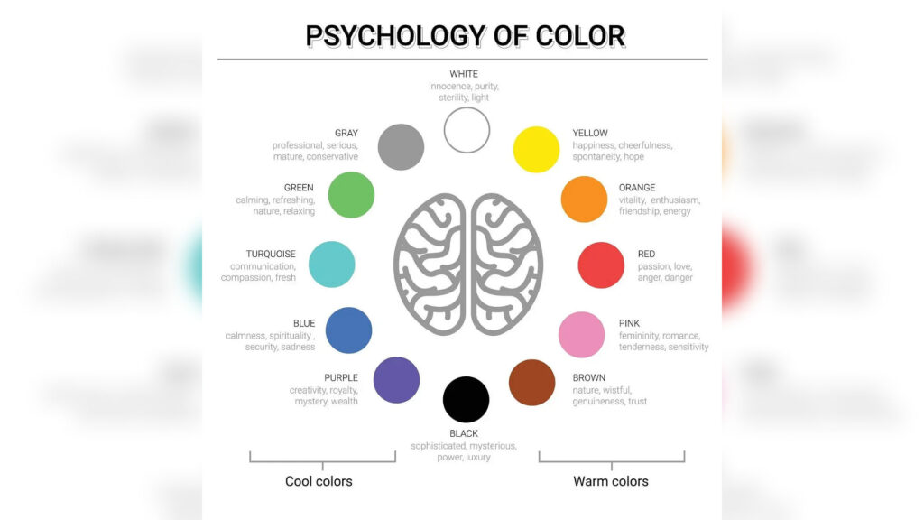
Understanding Color Psychology
Colors evoke emotions. Whether your audience realizes it or not, their brains are wired to respond to color cues. Here’s a quick breakdown of how common colors are perceived, particularly in the African and Kenyan context:
-
Red: Passion, energy, urgency. Great for restaurants, entertainment, and activism.
-
Blue: Trust, stability, professionalism. Widely used in finance, law, and tech sectors.
-
Green: Growth, health, prosperity. Perfect for agriculture, health, and sustainability brands.
-
Yellow: Optimism, warmth, attention. Works well for delivery services, hospitality, and creative agencies.
-
Orange: Friendliness, confidence, enthusiasm. Ideal for food, kids’ brands, or startups.
-
Black: Sophistication, power, formality. Common in fashion, luxury, and premium brands.
-
White: Purity, simplicity, cleanliness. Used often in health and wellness industries.
-
Purple: Creativity, royalty, mystery. Excellent for beauty, spirituality, and luxury services.
-
Brown: Reliability, authenticity, nature. Great for organic brands or traditional craft businesses.
It’s important to choose colors that reflect both your brand personality and what your customers want to feel when interacting with you.
Culture and Color in the Kenyan Context
Colors can mean different things across cultures. While global psychology gives us a starting point, Kenya’s diverse cultural landscape adds layers of meaning.
In some Kenyan communities, red might signify vitality and courage, but in others, it might be associated with danger or mourning. Green is often tied to agriculture and fertility, making it resonate with rural audiences. Gold and yellow hues may be linked to prestige and celebration.
Therefore, always consider your target audience’s background. Are they urban Gen Zs in Nairobi or rural families in Turkana? Are you targeting upper-middle-class professionals or young streetwear enthusiasts? Culture shapes perception, and perception shapes buying behavior.
Step-by-Step Guide to Choosing Color Palettes for Your Brand
Let’s walk through how you can build a cohesive and impactful color palette for your business.
1. Define Your Brand Identity
Before you pick colors, define your brand voice and values. Are you modern or traditional? Playful or professional? Local or global? Eco-conscious or tech-driven?
Write down 3–5 adjectives that describe your brand personality. For instance, a vegan skincare brand might write: natural, calming, clean, and elegant. A youth clothing store might write: bold, rebellious, trendy, and street-smart.
These traits will guide your color choices.
2. Understand Your Audience
Are you speaking to teens, parents, boda boda drivers, bankers, or tourists? Each demographic has different emotional triggers and aesthetic preferences.
For example, pastel tones may appeal to a Nairobi-based mommy brand, while a digital wallet app targeting hustlers might benefit from bold greens, blues, and blacks.
Use tools like Google Analytics, Instagram Insights, or simple customer surveys to understand your audience’s behavior and taste.
3. Choose a Dominant Color
Your dominant color should reflect the main emotion or value you want to communicate. This is the color people will associate with your brand the most.
If you’re a tech startup, blue is a safe bet. A beauty brand might lean towards soft pink or purple. A local food joint could go for red or orange to stimulate appetite.
Don’t just follow trends—align your main color with your brand’s core.
4. Add Supporting Colors
These add flexibility and depth. You’ll typically need:
-
A secondary color: It complements the dominant color without overpowering it.
-
Accent colors: Used for buttons, highlights, or calls-to-action.
-
Neutral shades: Whites, grays, and blacks that balance the palette and improve readability.
Example: For a Nairobi real estate brand targeting luxury buyers, you might go with navy blue (dominant), gold (accent), and white/gray (neutral).
5. Use a Color Wheel to Build Harmony
Understanding color relationships will help you create harmony:
-
Analogous schemes: Colors that sit next to each other on the wheel (e.g., green, lime, yellow) feel natural and cohesive.
-
Complementary schemes: Colors opposite each other (e.g., blue and orange) create contrast and energy.
-
Monochromatic schemes: Different shades of the same color give a minimalist, unified look.
Try tools like Coolors.co or Adobe Color to explore combinations before committing.
6. Test It Across Platforms
What looks good on a billboard might look bad on a phone. Always test your palette across:
-
Mobile screens
-
Desktop
-
Print (brochures, packaging)
-
Fabric (uniforms, merch)
-
Social media feeds
Make sure your colors are versatile and accessible in every use case.
7. Be Consistent, But Not Boring
Once you’ve chosen your palette, apply it everywhere—your logo, website, signage, packaging, email newsletters, and even invoices. This consistency builds recognition.
That said, don’t be afraid to create seasonal or campaign-based variations as long as they stay rooted in your core palette.
Kenyan Brands Nailing Their Color Palettes
Let’s look at real-world examples of Kenyan businesses using color effectively:
Safaricom: The green symbolizes growth and stability, while their evolving accent colors show adaptability and modernity.
Jumia Kenya: Their orange creates excitement and approachability, ideal for e-commerce and deals.
M-Pesa: The combination of red and green is both bold and trustworthy—perfect for a financial service rooted in everyday Kenyan life.
Bliss Healthcare: Clean blues and whites reflect professionalism and care.
Marini Naturals: Their palette mixes warm, earthy tones with a touch of gold, signaling authenticity, African pride, and quality.
These brands use color intentionally, not by accident.
Mistakes to Avoid When Choosing Color Palettes
Let’s keep you from making rookie mistakes:
-
Too Many Colors: Stick to 3–5 well-balanced colors. Too many confuse and dilute your brand.
-
Poor Contrast: Make sure there’s enough contrast between background and text. Don’t sacrifice readability for aesthetics.
-
Trendy Over Strategic: Just because pastel green is trending doesn’t mean it suits your brand.
-
Ignoring Accessibility: Color-blind users struggle with certain combos. Use online tools to check color accessibility.
-
No Style Guide: Without a documented palette and usage guide, your team or designer might stray from your brand tone.
Tips for Businesses on a Budget
If you’re not ready to hire a designer, here are practical steps:
-
Use free tools like Canva to test combinations
-
Search Pinterest for “Color Palettes for African brands”
-
Explore free resources like Coolors, Khroma, and Color Hunt
-
Create a mood board with product shots, competitor logos, and inspiration
-
Ask for honest feedback from actual customers
Also, local design communities on Twitter or Facebook are full of talented young creatives willing to consult or collaborate at reasonable rates.
Final Thoughts: Your Color Is Your Voice
In a busy market like Kenya, where businesses are launching every day, color can make or break your first impression. It has the power to stir emotion, build trust, and position your business in a crowded field.
Choosing the right Color Palettes isn’t about being flashy. It’s about being intentional. It’s about making sure your brand feels the same whether it’s on a business card, a matatu ad, or a TikTok post. With the right combination, you’ll not only look professional—you’ll feel unforgettable.
So the next time you see a brand and feel something—pride, trust, hunger, joy—remember: color did that. And your brand can too.