In the crowded landscape of modern business, where every brand is shouting to be seen, one might assume that a logo should directly show what a company does. A bakery should have a loaf of bread, a mechanic a wrench, and a clothing store a T-shirt. But when you look at the most successful brands in the world, you’ll notice something surprising—great logos often don’t tell you anything literal about the products or services offered.
Think of Nike, Apple, or even Mercedes-Benz. None of these logos scream shoes, computers, or cars. Yet they’re unmistakable and unforgettable. Why is that? Why do some of the most iconic brands shy away from the obvious and embrace the abstract, the minimal, or the metaphorical?
This guide will explore why great logos break away from the traditional mindset that a logo must represent what a business sells. We’ll also look at what truly makes a logo effective, examples from global and Kenyan brands, and how you can apply this thinking to your own business identity.
Table of Contents
ToggleThe Misconception: Logos Must Represent the Product
At face value, the logic seems solid. If you sell juice, why not put a fruit in your logo? If you’re in tech, shouldn’t your logo look futuristic? However, while this might seem practical, it can actually work against you in a saturated market. Here’s why:
-
Overused Concepts
Literal logo design ideas are often overdone. The market is flooded with coffee cups for cafes and light bulbs for tech companies. A generic symbol may cause your brand to blend in rather than stand out. -
Business Evolution
Your company might start with one product but evolve over time. If your logo ties you too closely to one offering, it could restrict your brand’s flexibility as you grow. -
Visual Clichés Lack Emotional Power
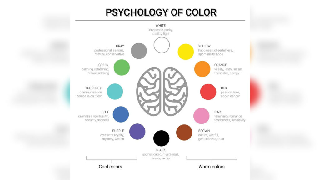
A literal image communicates what you do, but not how you make people feel. Great logos aim for a deeper connection that resonates on a psychological and emotional level. -
Consumers Aren’t That Literal
People don’t need to see an object to associate a brand with a product. Instead, they remember feeling, quality, and identity. Think of how we connect red and white swirls to Coca-Cola—it’s not about the drink itself but the experience.
What Makes a Logo “Great”?
If it’s not about being literal, then what truly defines great logos?
1. Simplicity
A strong logo is often simple enough to be recognizable at a glance. It doesn’t try to do too much. Instead, it focuses on a single powerful shape or visual that sticks.
2. Memorability
Great logos leave a lasting impression. You don’t need to see the Nike swoosh more than once to remember it. The uniqueness in form and style makes it easy to recall.
3. Versatility
An effective logo must work in various sizes, formats, and mediums—from a billboard in Nairobi to a mobile app icon. That’s why minimalism often wins.
4. Timelessness
Trendy elements fade. Logos that rely on current design fads can look dated quickly. Great logos stay relevant for decades because they are built on core principles, not passing styles.
5. Appropriateness
Even if a logo doesn’t show the product, it should still feel right for the brand’s personality. A law firm logo shouldn’t feel like a circus poster. It’s about tone and visual language, not literal content.